
The Business
Based on their own family recipes and a name chosen by their only child, this company wanted to stand out against every other hot sauce brand…
Their biggest advantage was their approach to having their child have a say in the creativity of their business!
The Brand
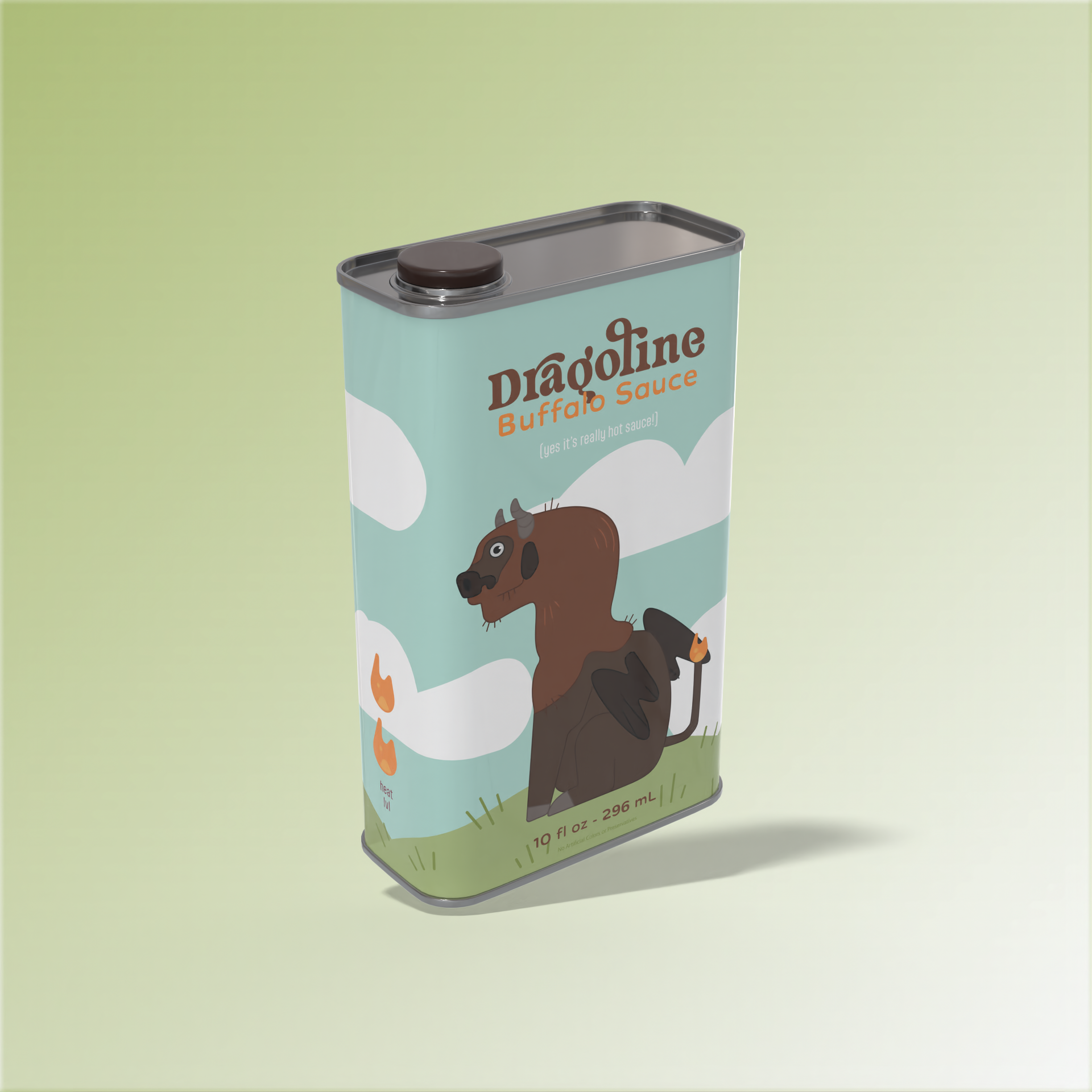
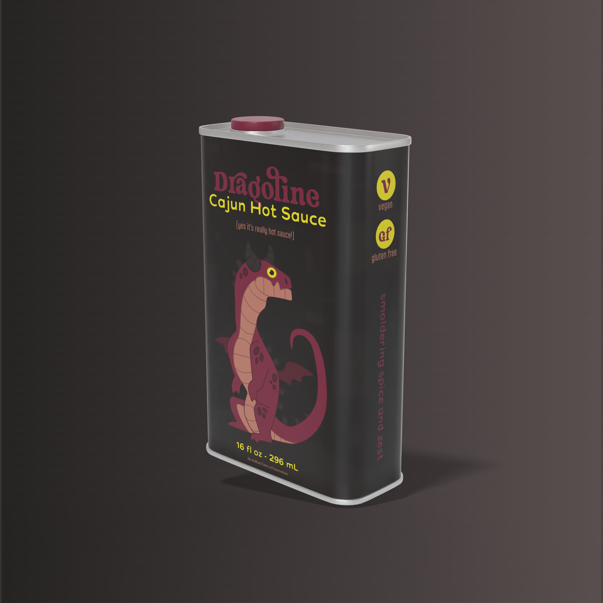
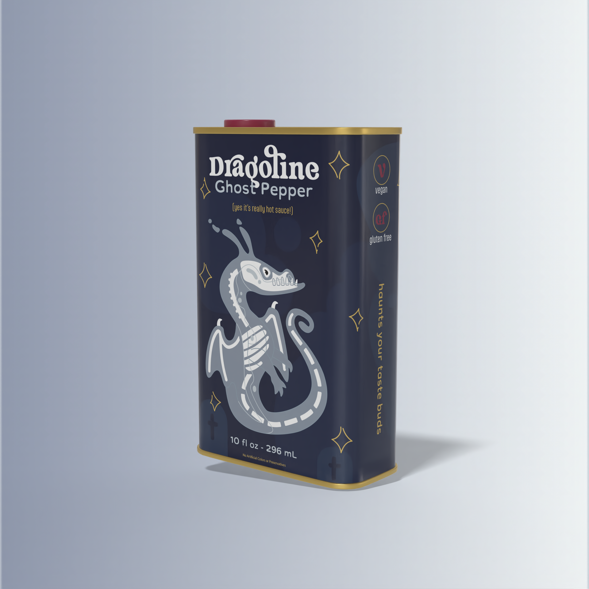
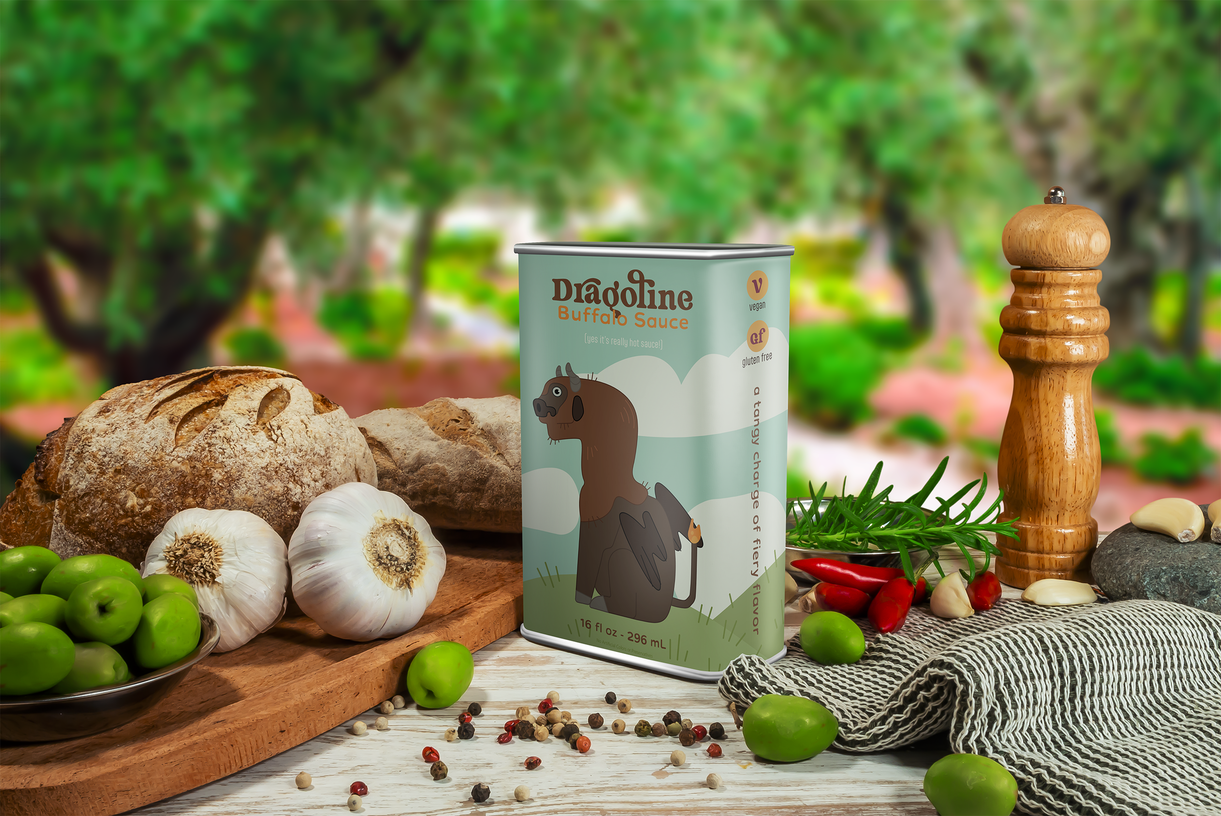
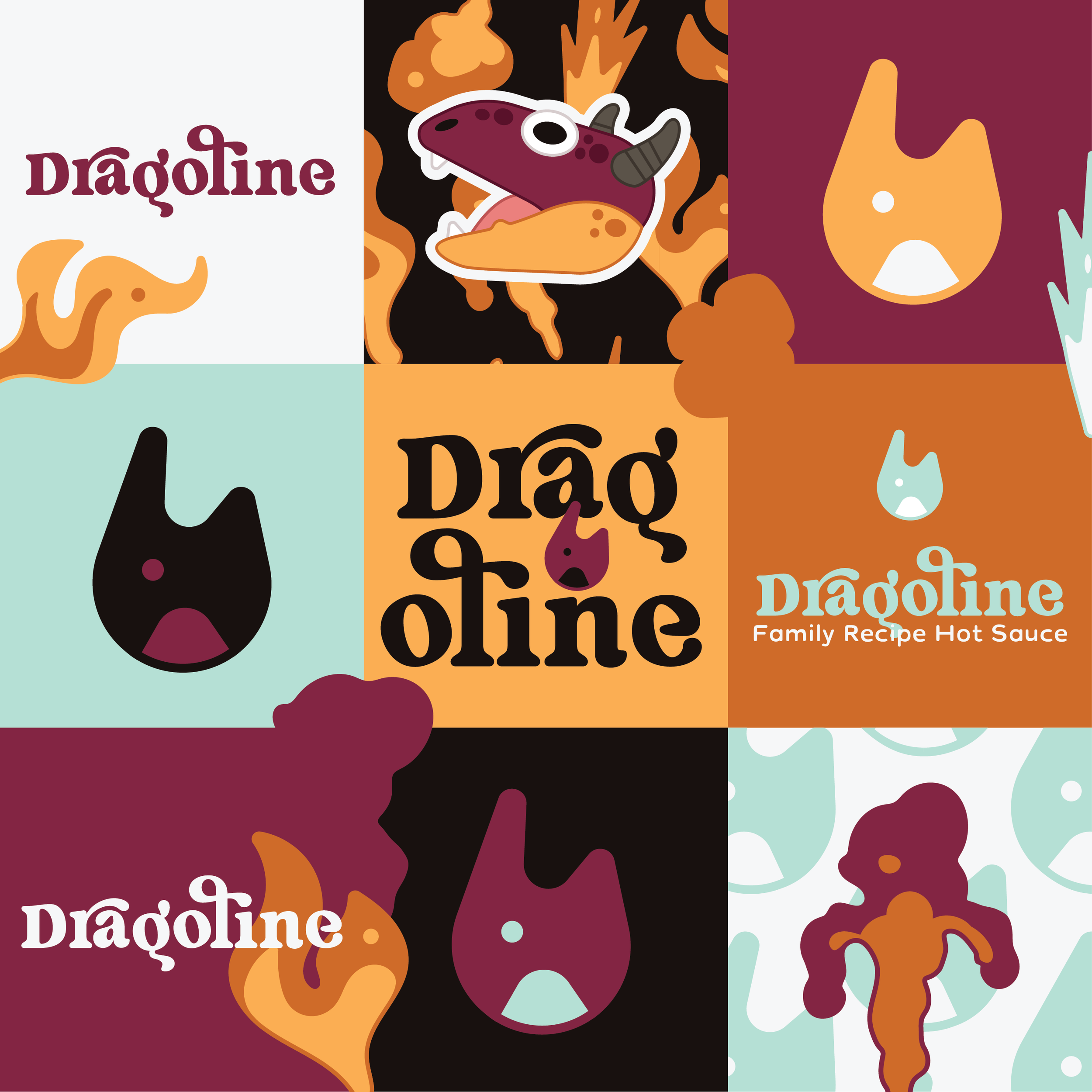
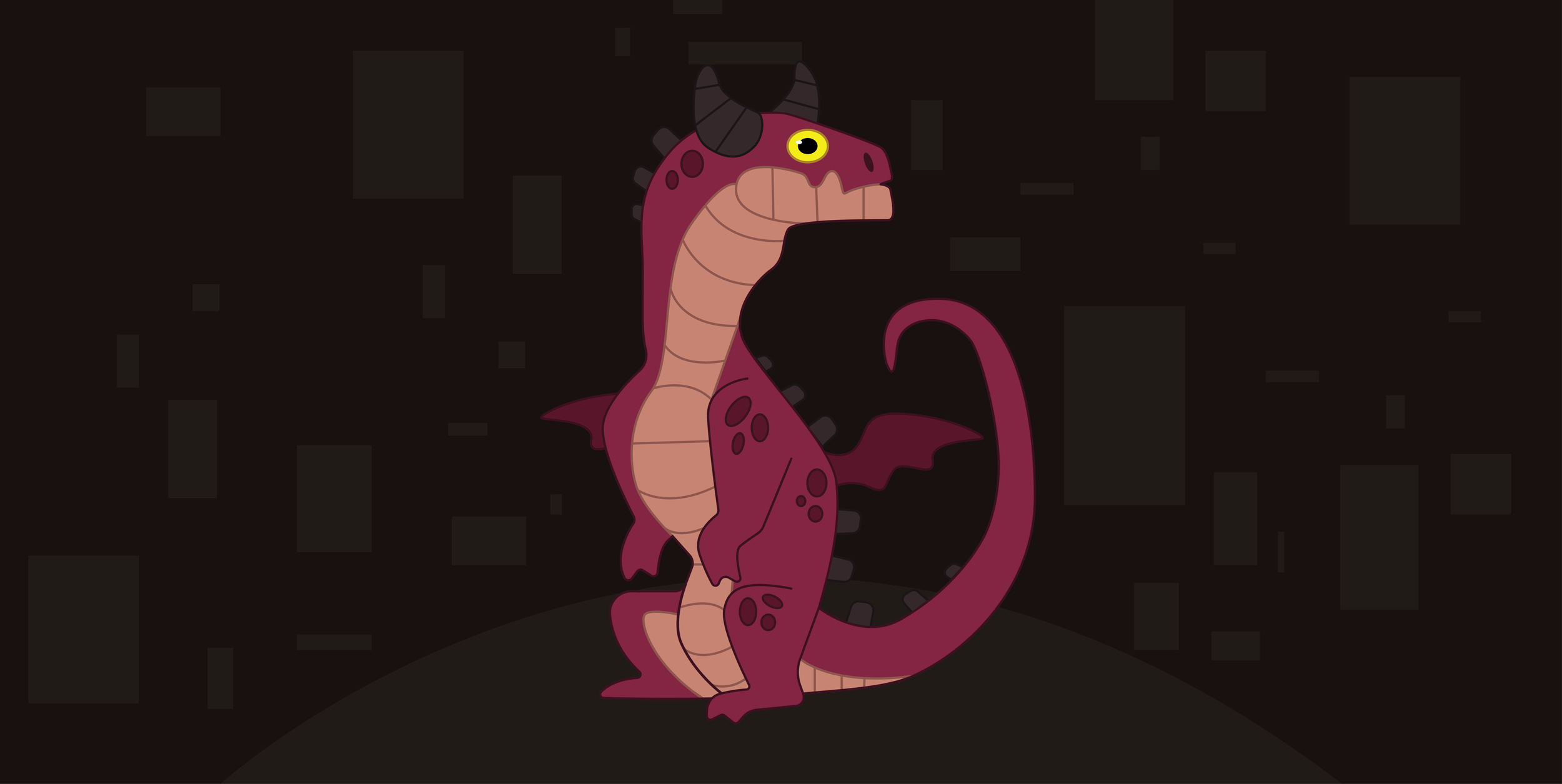
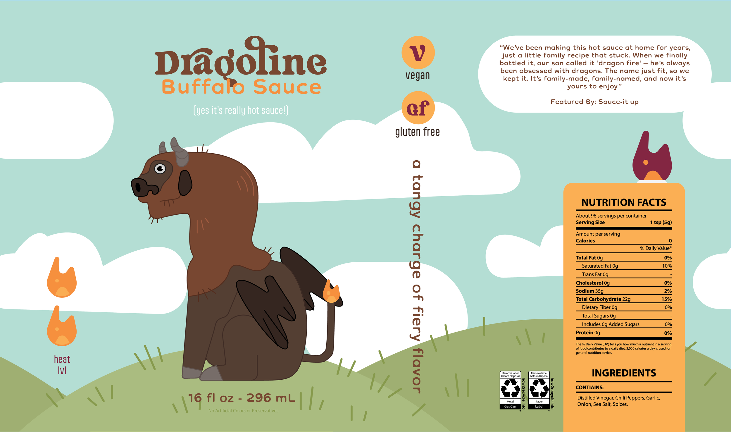
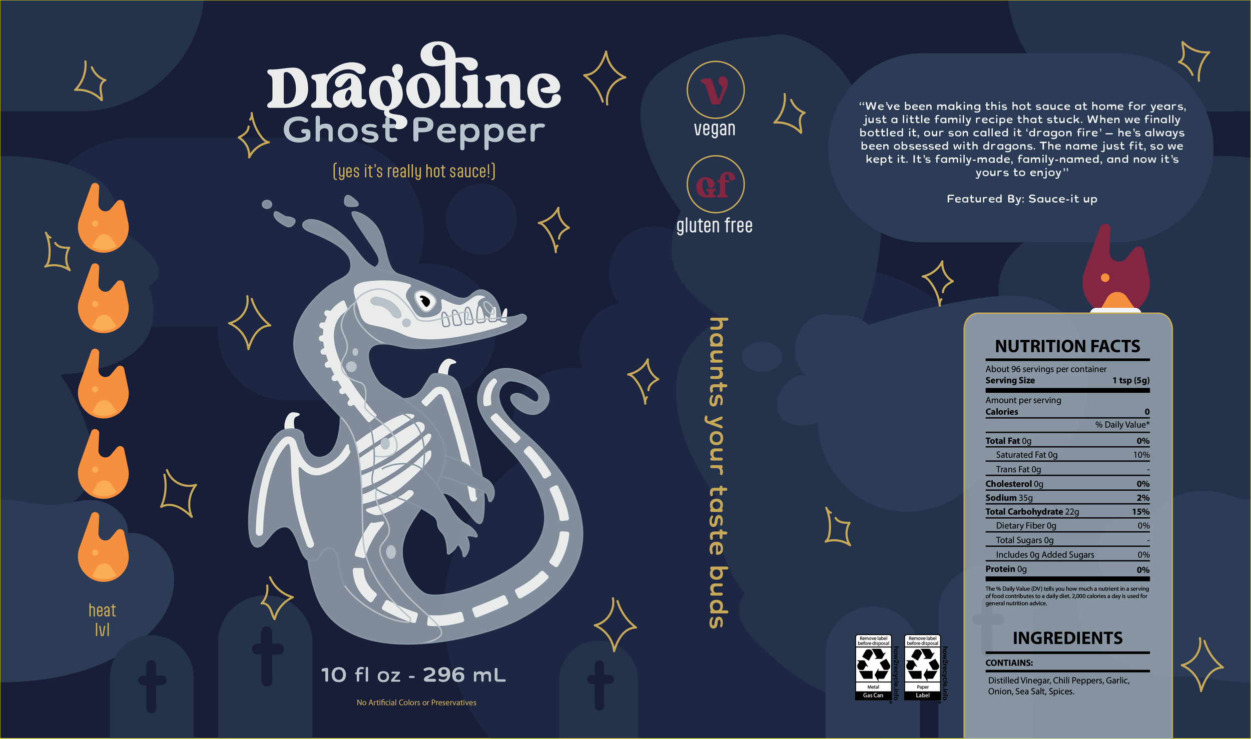
We chose a fun modern cartoon style that represents dragons drawn by a kid, going along with their idea to have their own child get a say. It was this idea of a family letting young creativity that still attracts all ages and stands out from every other brand using the same style that really set the tone for this project. I chose a color palette that is bright and playful but also energetic and very much on fire ;) It also can pair well with a variety of other colors to further expand the brand when new products come out because it’s the illustration and shapes of this brand that are the keystones rather than being strict in all aspects. Overall it’s fun and creative for all ages and very noticeable!

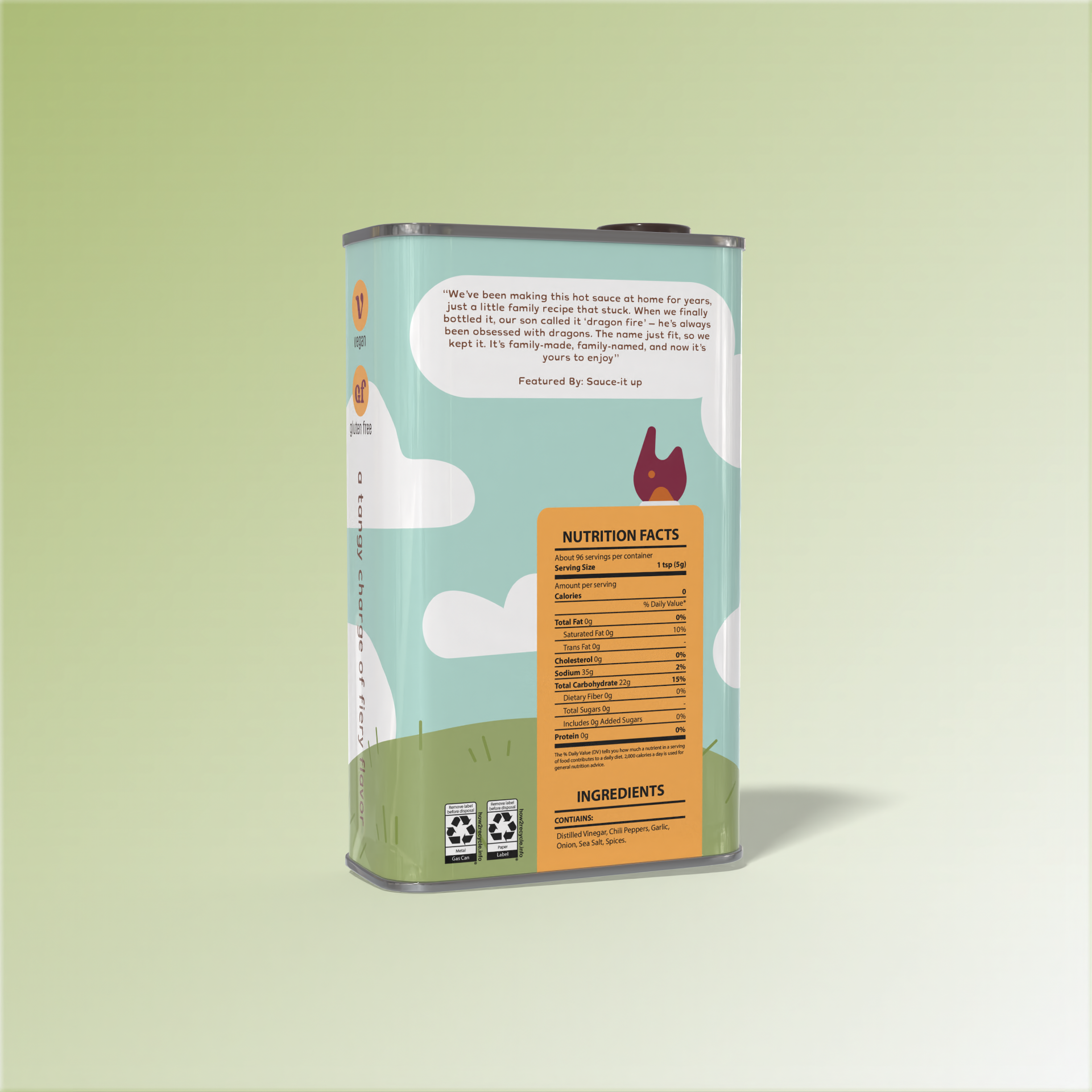
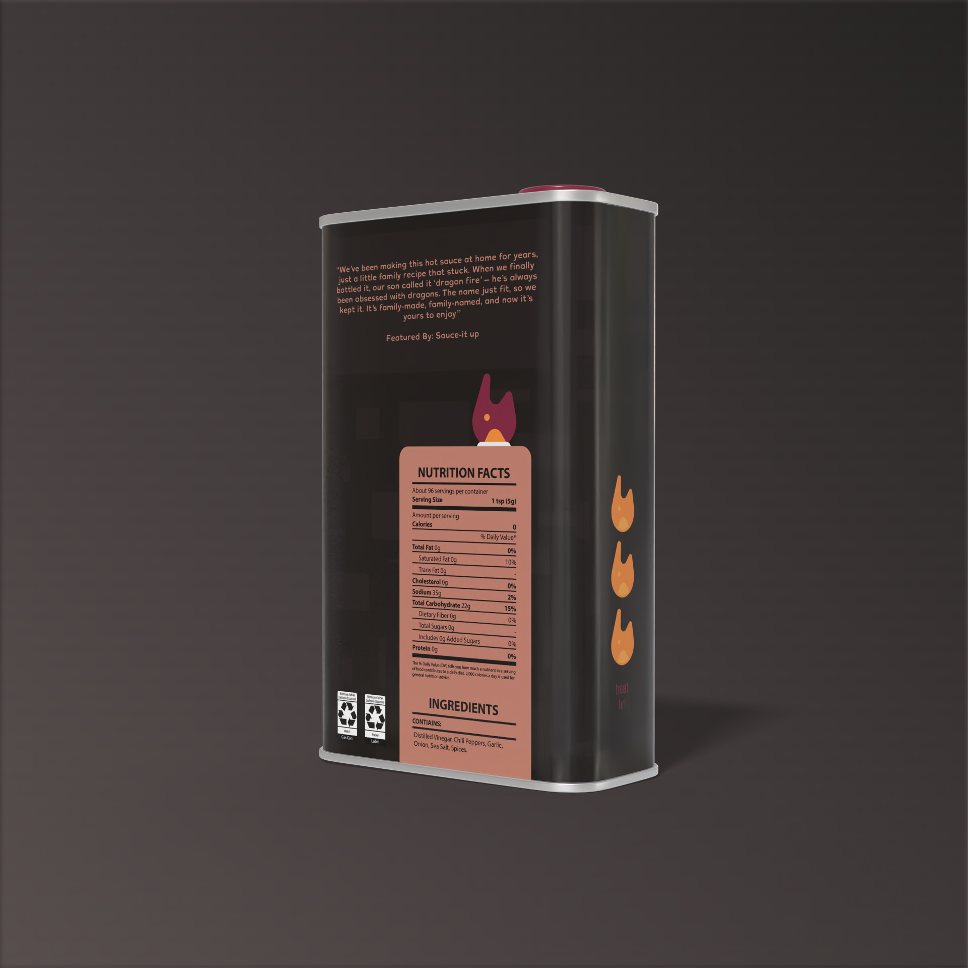
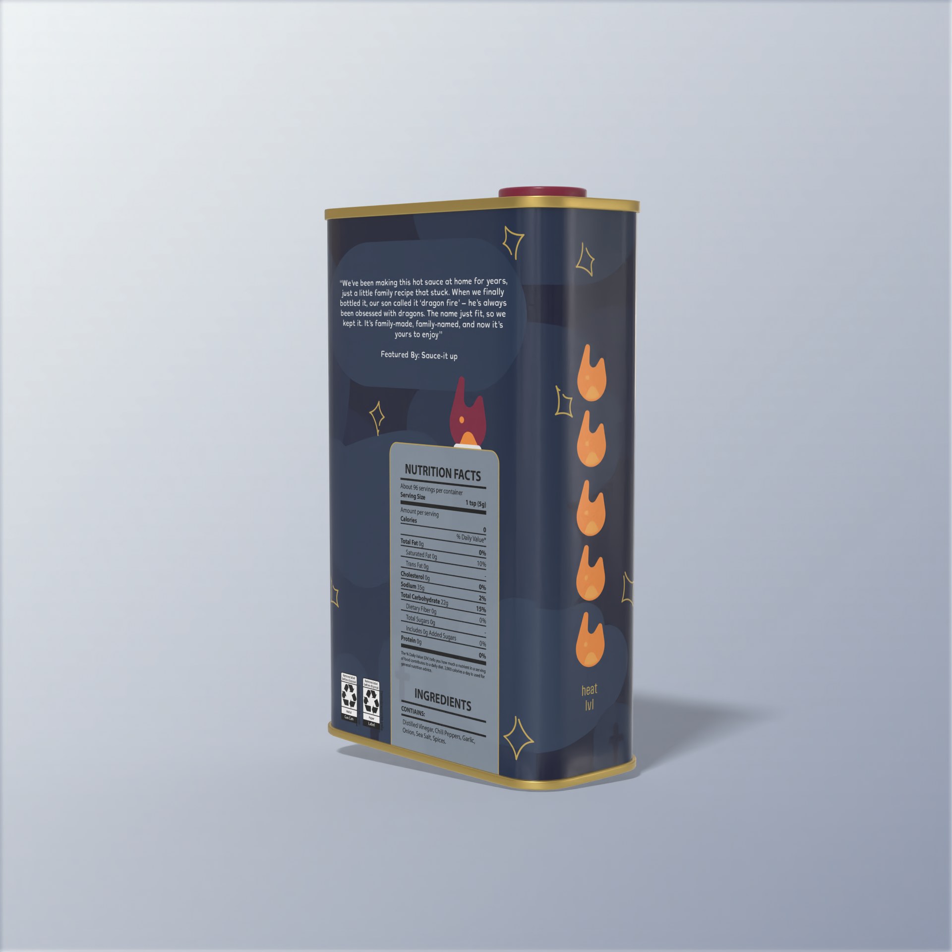
Dragoline is a creative and outstanding show of how personal details are what make your brand unique and interactive over trying to fix into the corporate styles that already fill our shelves. Dragoline also offers an amazing program against consumerist waste by taking your empty bottles, washing, and reusing them! They’re also 100% recycled and recyclable if you choose to throw it away instead.
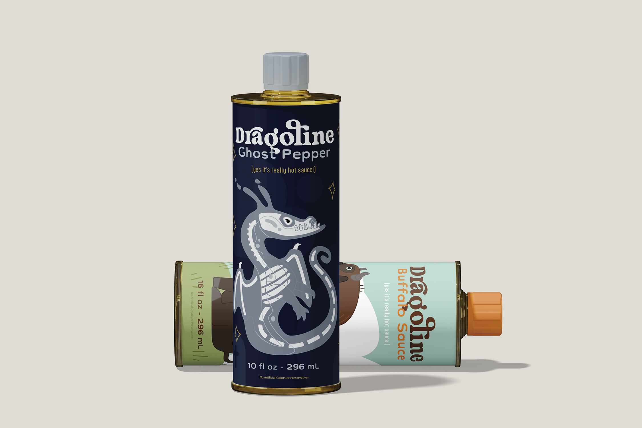
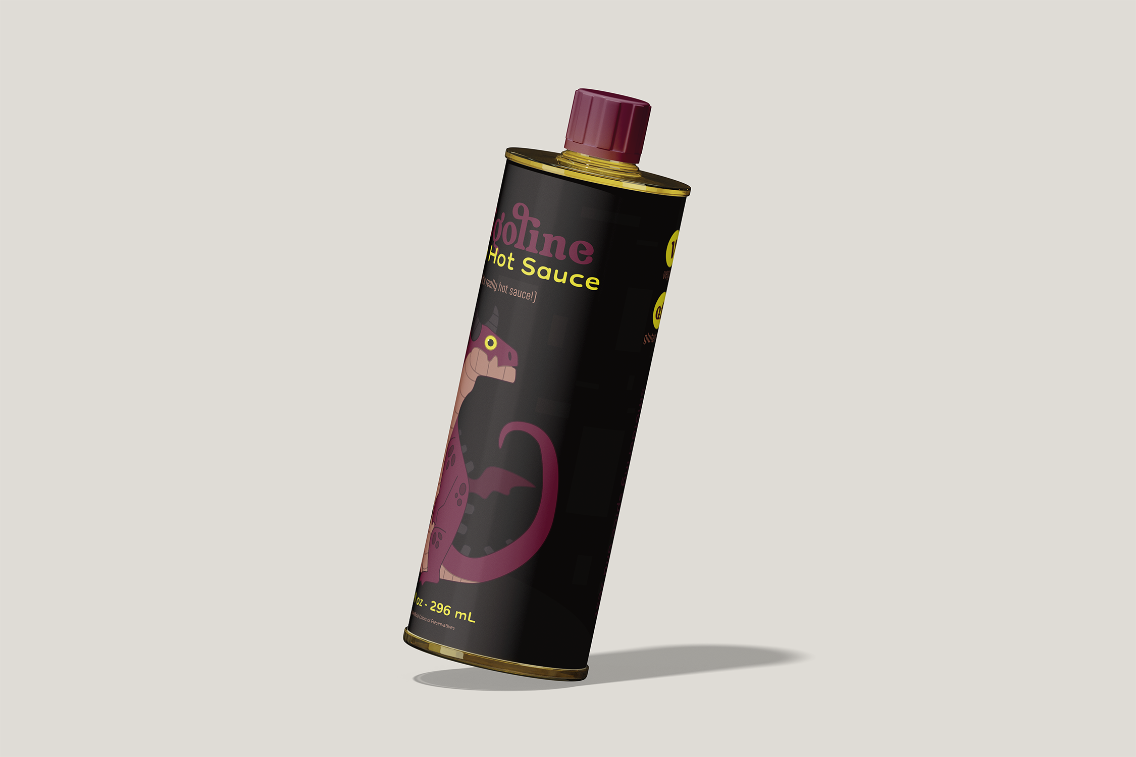
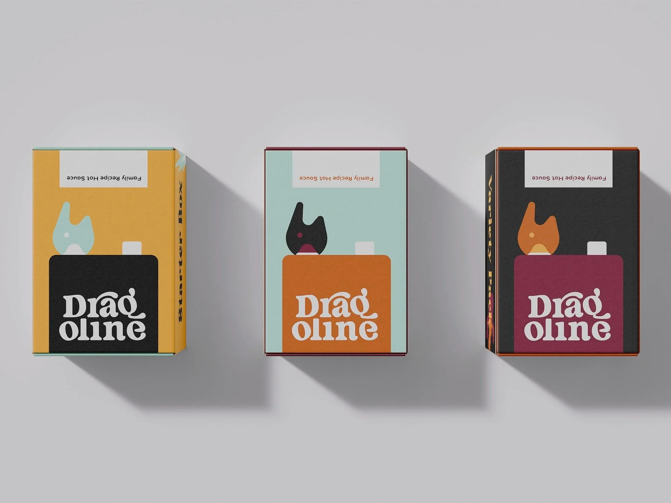
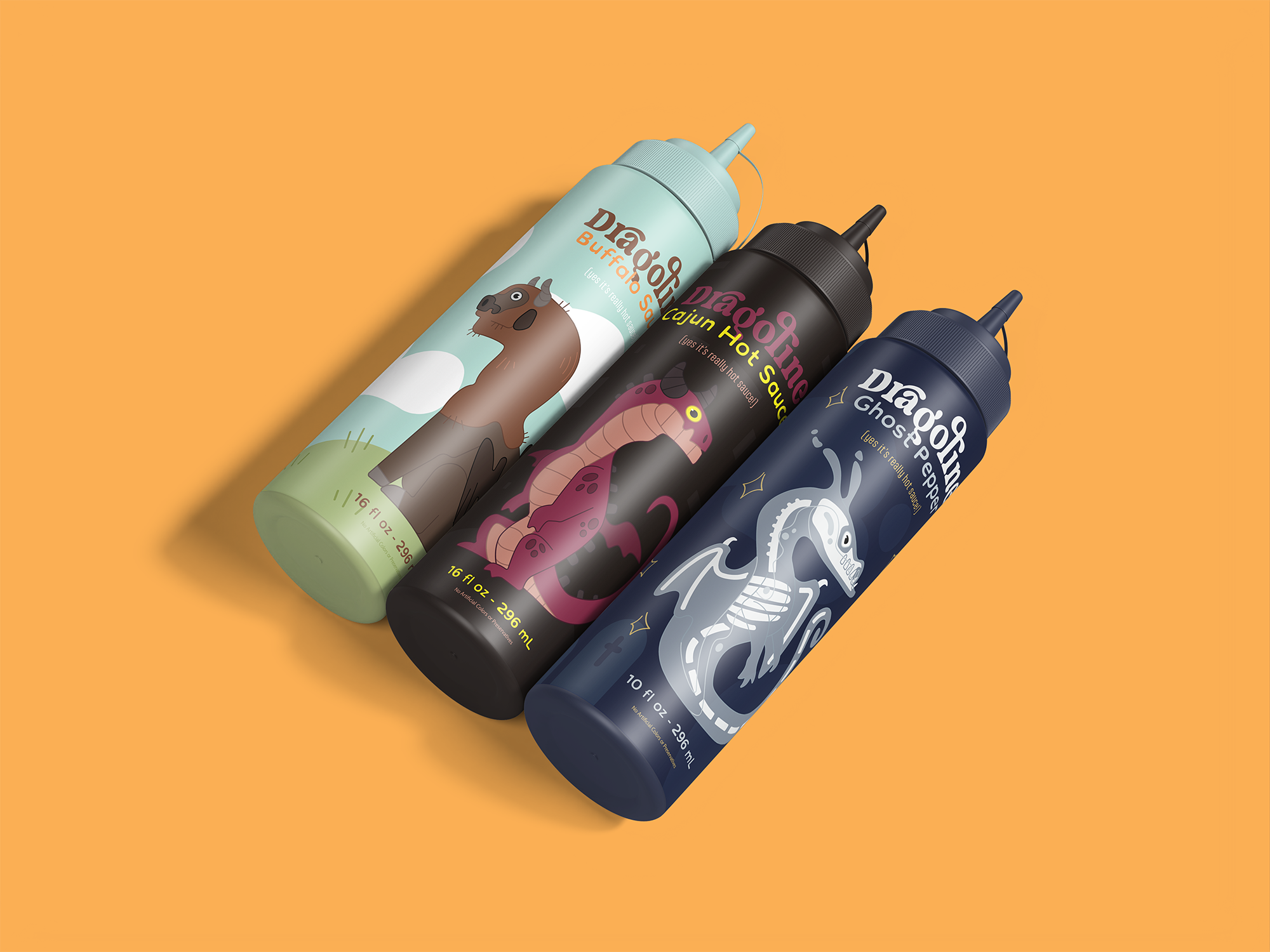

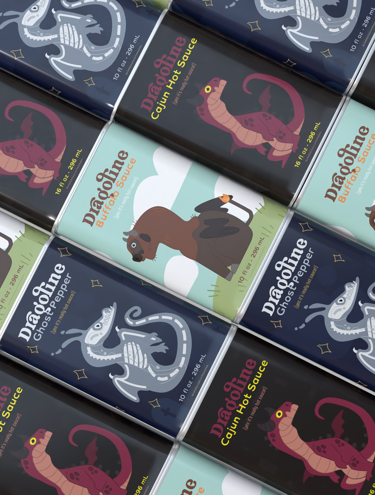
The Packaging
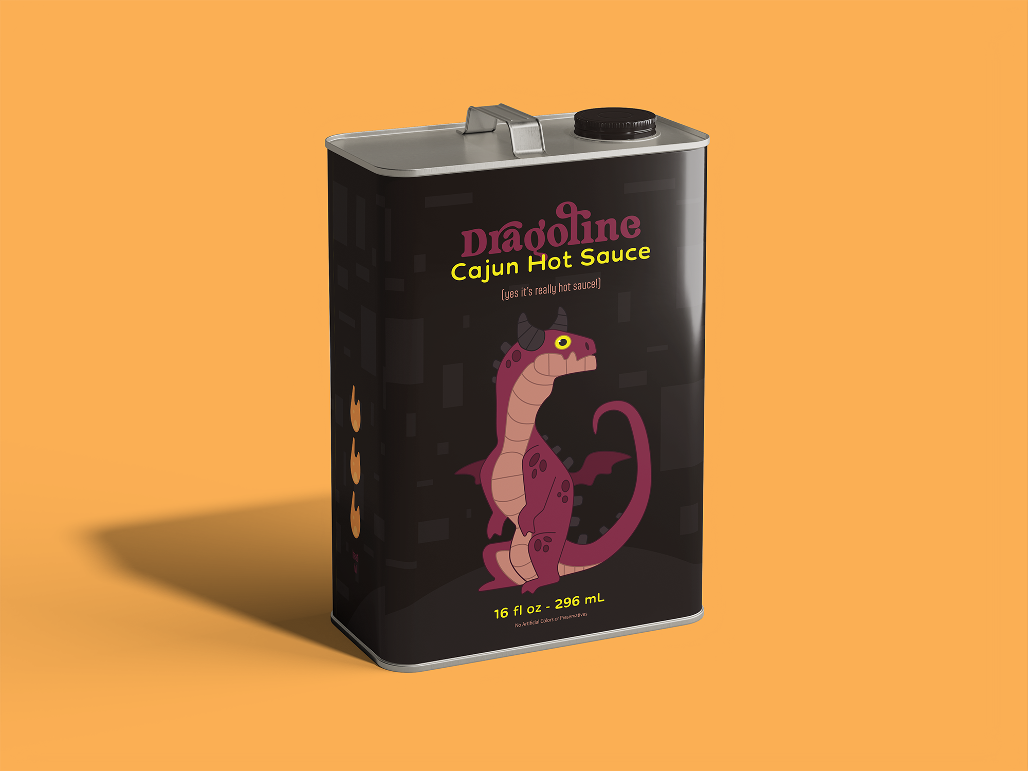
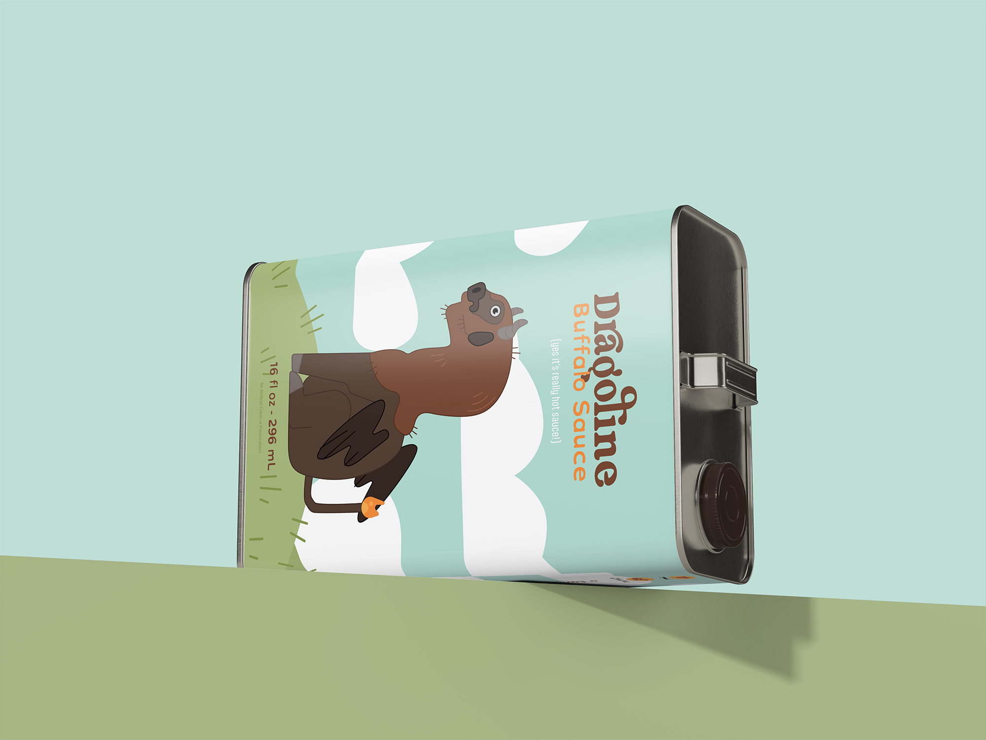
Dragoline is simple and cute, using the classic art trick of illusion to create scenes to immerse you into each bottle and character! Add a can on the back with some fire to represent gasoline with the dragon to complete the namesake and you’ve got yourself the design! The sides each contain different info as well, the left has the heat level of the sauce depicted by the amount of fire icons and the right has a short slogan for each sauce along with the disclaimers that each sauce is vegan and gluten free.
For the back we also have the important info we need to have legally, but that doesn’t mean it has to be ugly! Using that oil can we have a fun way to encase the nutrition and ingredients, next to that we have the recycle info aligned neatly to keep the design clean. And on the top, contained by a box that blends with the background is some text that enforced the trustworthiness of the brand using a quote from a ratings article.