

Visual Identity + Shipping & Product Packaging Design
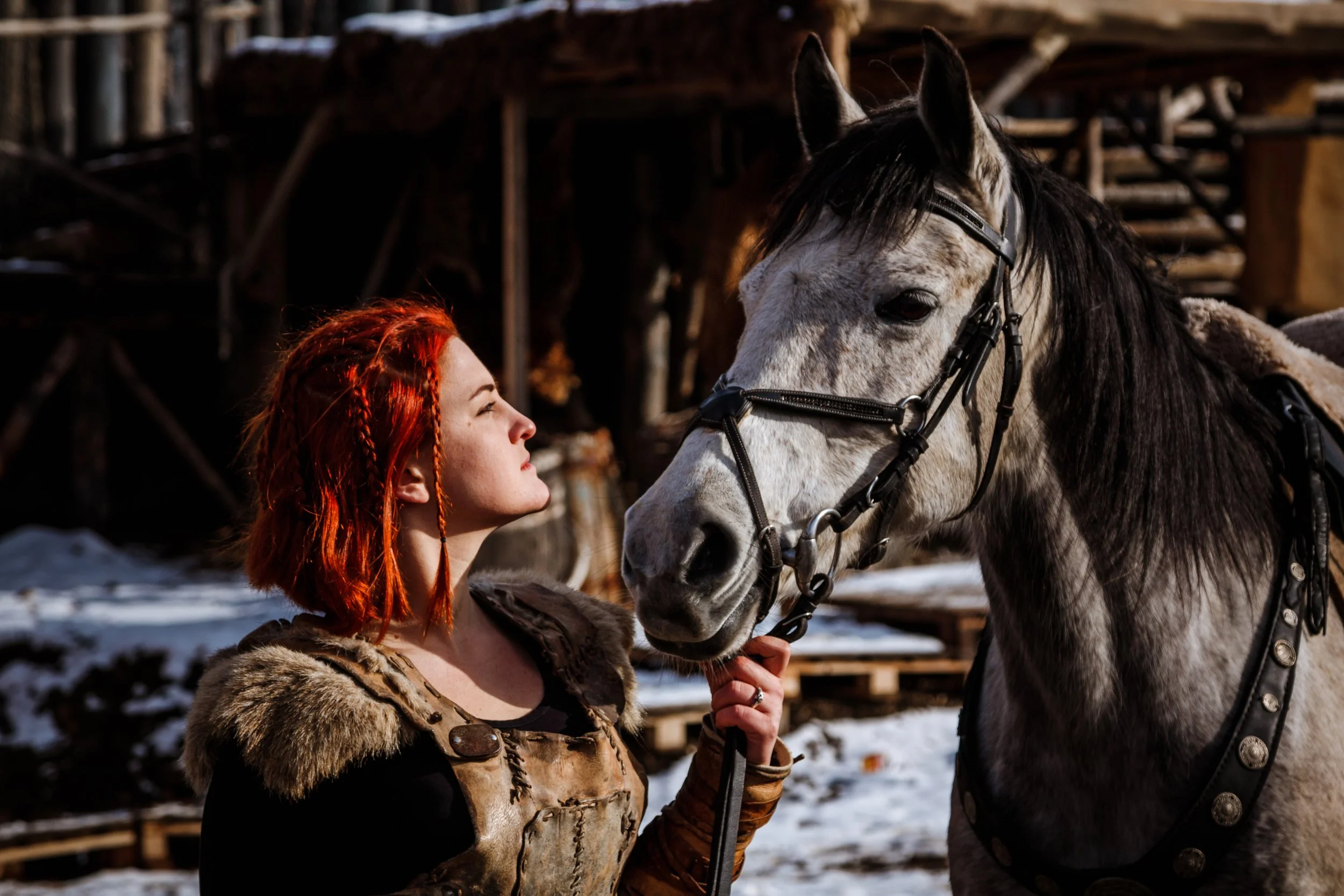
Sleipnir Equestrian is a brand steeped in tradition of norse forgery and craftsmanship, dedicated to bringing back the personal touch and appeal of hand crafted gear. They are creators of warrior worthy equipment made for any willing to risk a chance on high quality made by hand, leather, and forge. Sleipnir honors the grit of handmade work while pushing the brand into a premium, niche market. The design blends sharp, rune-inspired typography with raw textures and symbolic marks that feel forged. The visuals are built to reflect both the resilience of warriors and the intimacy of handmade artistry. With a name drawn from Odin’s eight-legged steed, this brand reimagines Norse traditions through functional, handcrafted equestrian gear. The challenge was to build a brand identity that felt ancient but still relevant, evoking stories of old while appealing to modern-day riders who crave durability, quality, and meaning in what they wear and use.
Core Concept
Sleipnir uses myth and tradition to create gear in the same way as old, with stubbornness and care. Sleipnir is a brand based on rough strength and careful attention to premium quality.
Main Goals
Differentiate in a sleek market of premium or cowboy brands that are all similar, we needed to stand out and emphasize the USP of Sleipnir in their care for a gorgeous style of work.
Special Ties
The owner is of norse lineage and grew up with stories and crafts passed down in their family.
Deliverables
Logo suite, pattern, typography, color palette, brand strategy & creative direction, messaging and tone, custom illustrations, brand guidelines, 5 Dielines, Shipping box designs, hand up display design, box display designs, Print-ready files


