
About Them

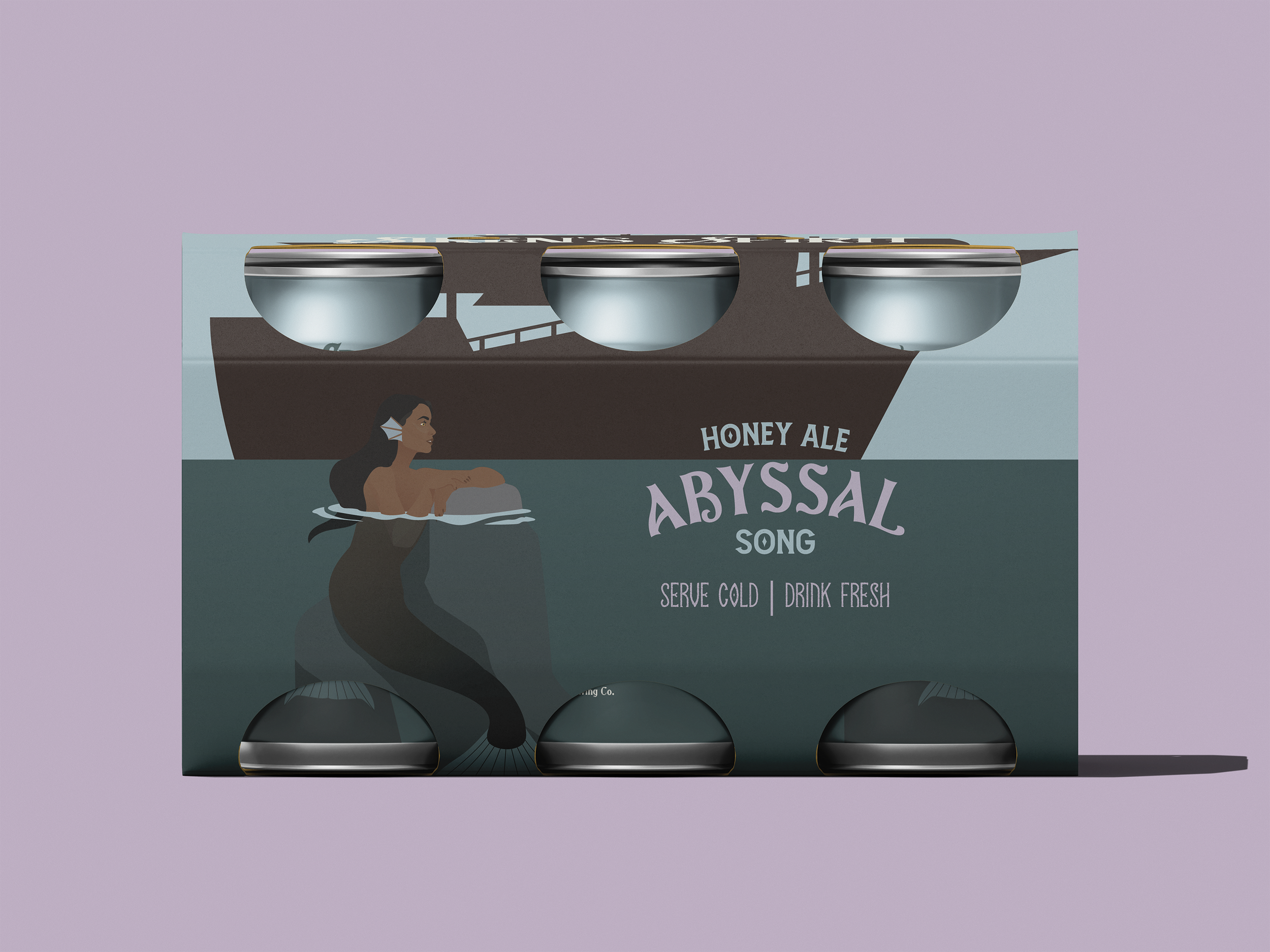
Siren’s Spirit is a brand of various alcohols targeted towards adventurous and powerful women who know beauty doesn’t diminish competence. They are meant for powerful women by powerful women, built around lores and legends of alluring women turned to monsters by the men who survived their encounters with these enchanting women. These ales relax and empower those who dare to drink them, and a portion of the patronage given when buying a drink from Siren’s Spirit goes to shelters and support efforts for women.
Product & USP
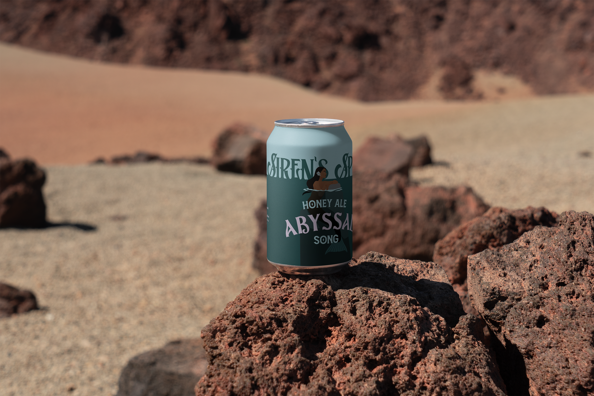
The “Abyssal Song” variant is designed to evoke intrigue, allure, and the untamable pull of the sea. The challenge was to develop a packaging design that seamlessly balanced mystery, seduction, and vintage storytelling with shelf appeal and clear communication. Inspired by sailor folklore and the beautiful power of sirens, the packaging tells the story of a siren surfacing from the abyss to customers into adventure.
The Experience
The deep ocean hues blend with muted pastels to create contrast and a relaxingly happy mood, while the typography and layout echo old maritime signage in a modern and clean style to show daring and adventure.


The sustainability
Siren’s Spirit pairs bold taste with a clear commitment to the planet. Every can is made from recycled aluminum — one of the simplest sustainable materials in the world — and is infinitely recyclable, meaning it never needs to end up as waste. Designed to make an impact without leaving one behind. By choosing recycled and recyclable packaging, Siren’s Spirit proves that strength isn’t just in flavor or story, it’s in standing up powerfully in the face of what is typical.