

About Them
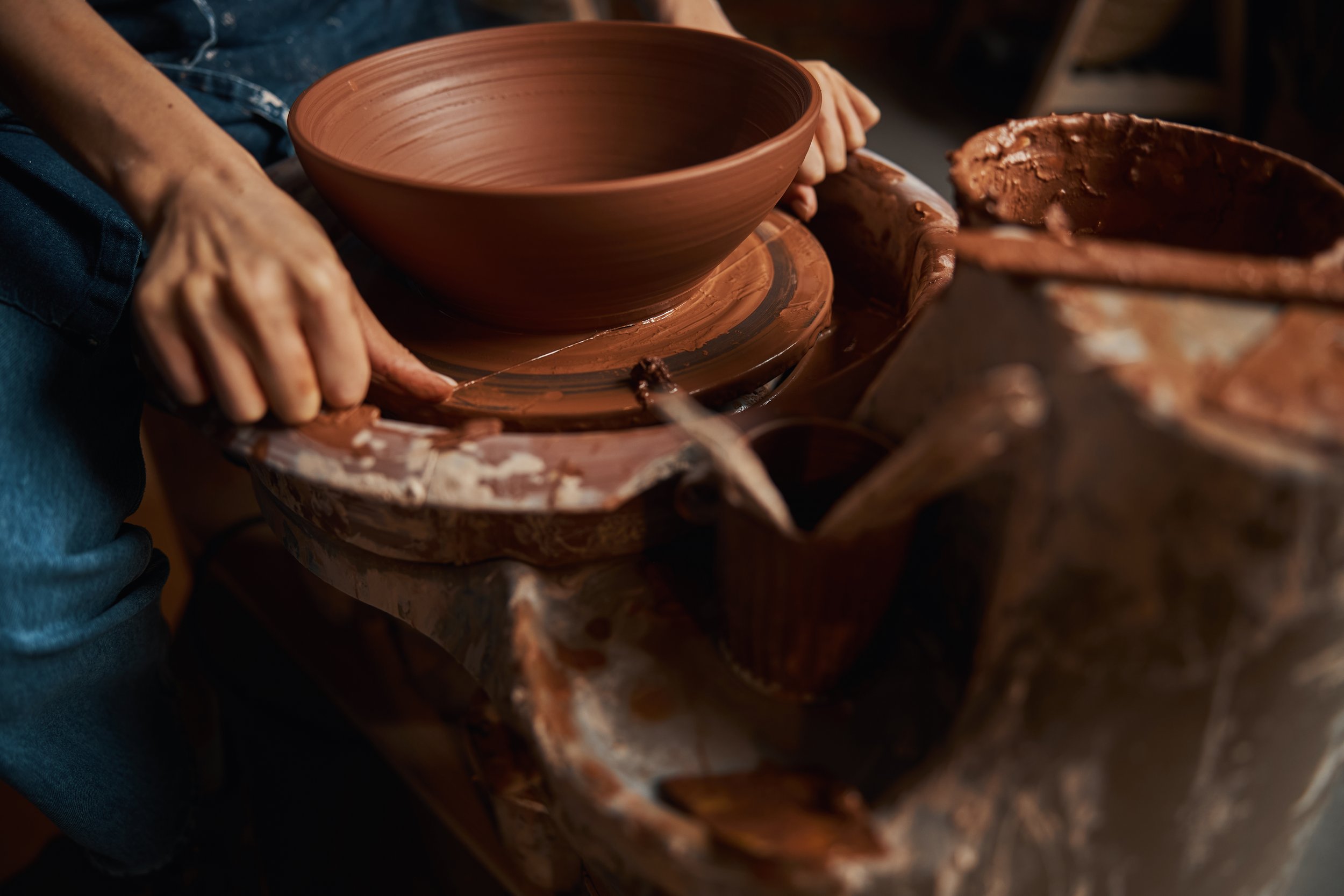
Sacred & Shattered is a woman-owned brand dedicated to breathing life back into broken things. Specializing in restoring old, forgotten pottery, each piece is carefully mended and given a new story — one that honors both its past and its rebirth. More than just ceramics, the brand represents empathy, resilience, and connection, showing that what’s fractured can still hold beauty, meaning, and purpose. Every object becomes a reminder that brokenness is not the end, but the beginning of something sacred.

Product & USP
They transform broken pottery into one-of-a-kind art pieces, each repaired with care and given new meaning. Woman-owned and rooted in empathy, the brand’s unique value lies in turning forgotten fragments into objects of connection — celebrating beauty in what was once shattered.
The Experience
Each vessel carries its history, its cracks, and its revival, allowing people to bring home an object that feels deeply personal. The experience is one of reflection and empathy, a piece that reminds you that beauty doesn’t come from perfection, but from the stories we carry and the lives we rebuild.


The sustainability
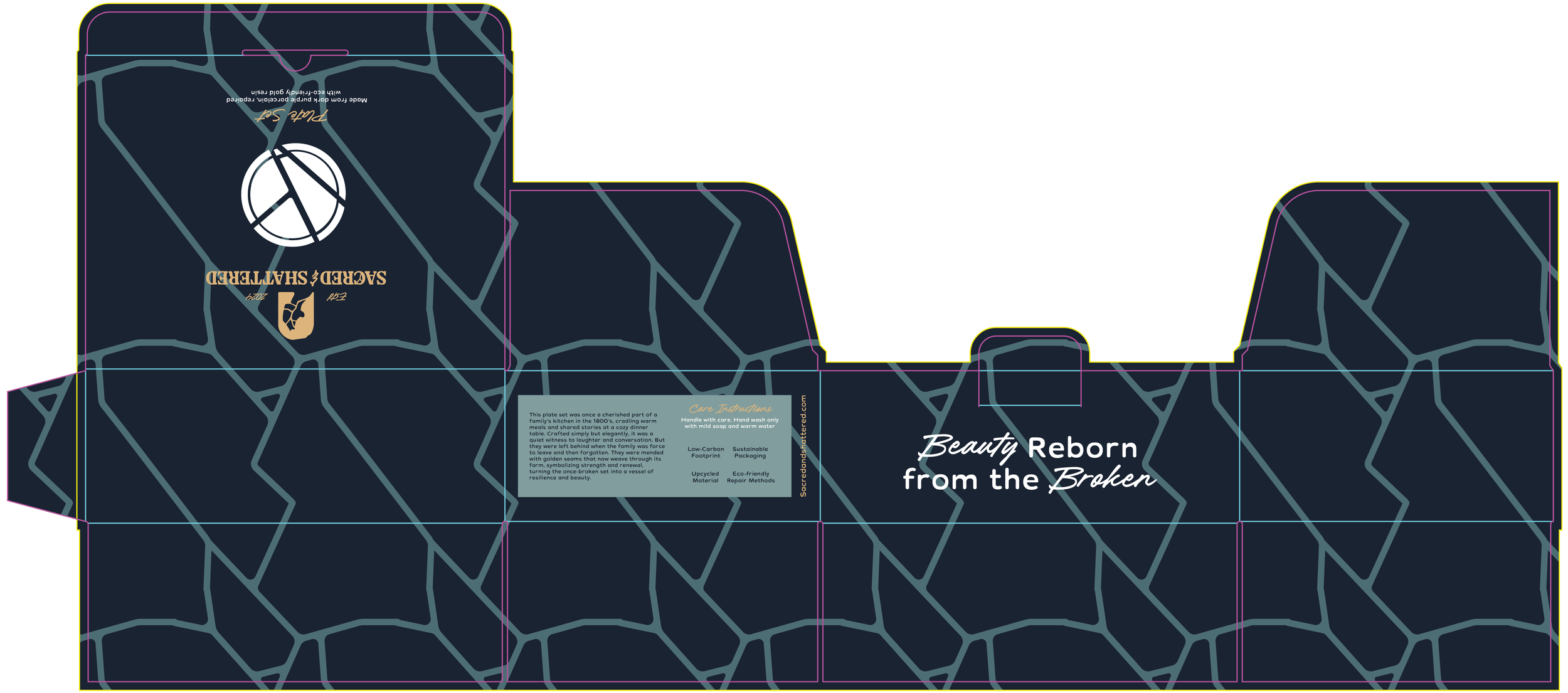
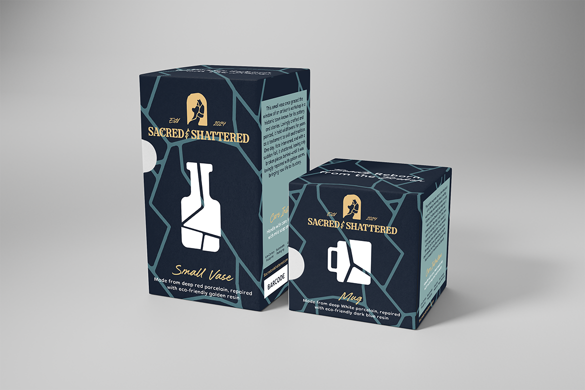
Sacred & Shattered is about giving broken pottery another chance instead of letting it end up forgotten or thrown away. Every piece we work with already has a history, and putting it back together means less waste and more meaning. It’s not about making something flawless — it’s about letting the cracks and repairs be part of the story, and turning what once felt useless into something you can actually connect with.
We carry that same mindset into how we package our work. Each piece is shipped in simple kraft boxes that can be recycled or reused, without the plastics and coatings that usually end up in the trash. The packaging is sturdy enough to keep things safe but pared back to what’s necessary — no extras, no filler, just honest packaging that lines up with what we believe in.